

|
Math Ohio SLC: Represents a mathematical relationship using a table, graph, symbols, and words, and describe how a change in the value on one variable affects the value of a related variable. Prior Knowledge: In Search of the Oregon Trail
|
|||||||||||||||||||


|
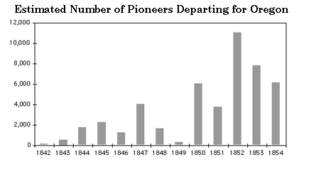
Beginning with the first organized wagon trains in the early 1840's, the flow of pioneers heading for Oregon steadily increased. What may have caused the dip in 1849? Remember, these are the pioneers who chose Oregon when they came to the split in the trail |
|
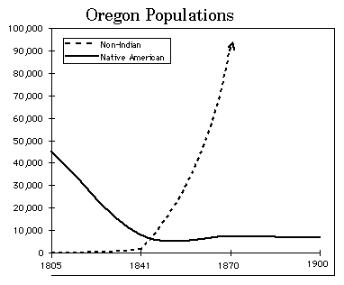
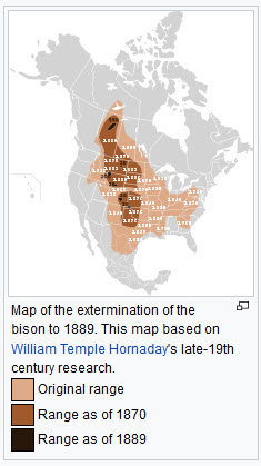
Almost immediately after the arrival of people of european origin, the Native American populations started to decrease. What were some of the reasons for the diminishing numbers? |
Problem:
Study the buffalo population by creating two graphs (charts) in Excel.
More Prior Knowledge: The following chart was created based on the
estimated buffalo population in aboriginal times, 1800, and 1850 figures.
Today’s bison population numbers around 500,000, and is growing due in large part to commercial bison ranching.
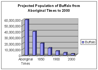
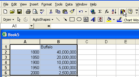
Chart 1
Create a chart that shows the projected estimates of buffalo from 1800
to 1870.
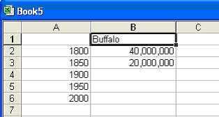
Set your table up this way:
Making Your Chart
1. Highlight A:1 - B:6 and click on Chart Wizard.
2. Select cluster column with a 3-D visual effect and click on next.
3. A visual will show your data, select Series in: columns and click next.
4. Type in the title of the chart: Buffalo Population Estimated 1800 - 1870.
5. Type Year for the X axis.
6. Type Number for the Z axis.
7. Click on next.
8. Choose an object in sheet 1 and click on finish.
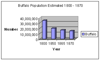
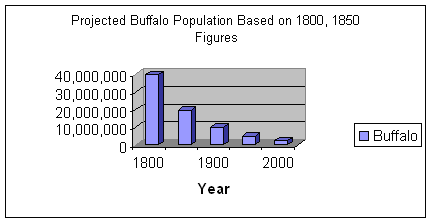
Chart 2
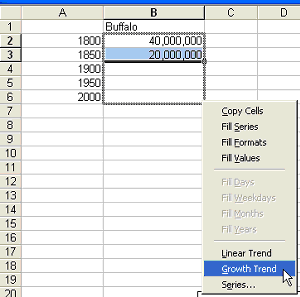
Create a second chart that shows the growth trend for 1900, 1950, and 2000 based on the 1800 and 1850 figures. Set your table up in Excel this way:
Using the CONTROL key to produce a default Growth Series
1. Begin by highlighting the cells with information in them.
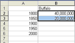
2. Position your cursor at the lower right of the last highlighted cell
so that it becomes a FILL HANDLE.
Press and hold the CONTROL key.
While still holding the CONTROL key, right click and drag the FILL HANDLE
over the empty cells you want to complete.
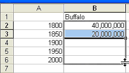
Release the CONTROL key, then release the mouse button.
A menu pops up -- select Growth Trend.
Making Your Chart
9. Highlight A:1 - B:6 and click on Chart Wizard.
10. Select cluster column with a 3-D visual effect and click on next.
11. A visual will show your data, select Series in: columns and click next.
12. Type in the title of the chart: Projected Buffalo Population Based on
1800 and 1850 Figures.
13. Type Year for the X axis.
14. You can leave the Z axis blank.
15. Click on next.
16. Choose an object in sheet 1 and click on finish.
Think about these questions when comparing the three charts.
1. What caused the decline in buffalo population during the 1800s?
2. Was the buffalo population in decline before 1800? If so, why?
3. How accurate are the projections based on the approximate 350,000 population
of buffalo today?
4. Make a prediction about the buffalo population for the year 2050 and
create a chart. (Application of Knowledge for Assessment)
Resource for the Math Lesson:

![]()
© 1996 - 2011 Linda C. Joseph
All Rights Reserved
All CyberBee Graphics are Trademarked
Graphics by
Darlene Vanasco/Creative Director
Erika Taguchi/Designer & Illustrator
Hosting Provided by Iwaynet